Making Better PowerPoint Presentations
We have all experienced the pain of a bad PowerPoint presentation. And even though we promise ourselves never to make the same mistakes, we can still fall prey to common design pitfalls. The good news is that your PowerPoint presentation doesn’t have to be ordinary. By keeping in mind a few guidelines, your classroom presentations can stand above the crowd!
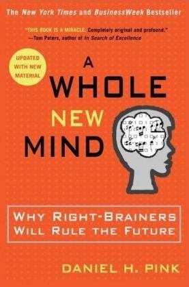 “It is easy to dismiss design – to relegate it to mere ornament, the prettifying of places and objects to disguise their banality. But that is a serious misunderstanding of what design is and why it matters.”
Daniel Pink
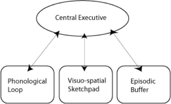
Baddeley and Hitch’s model of working memory.
One framework that can be useful when making design decisions about your PowerPoint slide design is Baddeley and Hitch’s model of working memory.

As illustrated in the diagram above, the Central Executive coordinates the work of three systems by organizing the information we hear, see, and store into working memory.
The Phonological Loop deals with any auditory information. Students in a classroom are potentially listening to a variety of things: the instructor, questions from their peers, sound effects or audio from the PowerPoint presentation, and their own “inner voice.”
The Visuo-Spatial Sketchpad deals with information we see. This involves such aspects as form, color, size, space between objects, and their movement. For students this would include: the size and color of fonts, the relationship between images and text on the screen, the motion path of text animation and slide transitions, as well as any hand gestures, facial expressions, or classroom demonstrations made by the instructor.
The Episodic Buffer integrates the information across these sensory domains and communicates with long-term memory. All of these elements are being deposited into a holding tank called the “episodic buffer.” This buffer has a limited capacity and can become “overloaded” thereby, setting limits on how much information students can take in at once.
Research about student preferences for PowerPoint
Laura Edelman and Kathleen Harring from Muhlenberg College, Allentown, Pennsylvania have developed an approach to PowerPoint design using Baddeley and Hitch’s model. During the course of their work, they conducted a survey of students at the college asking what they liked and didn’t like about their professor’s PowerPoint presentations. They discovered the following:
Characteristics students don’t like about professors’ PowerPoint slides
- Too many words on a slide
- Clip art
- Movement (slide transitions or word animations)
- Templates with too many colors
Characteristics students like like about professors’ PowerPoint slides
- Graphs increase understanding of content
- Bulleted lists help them organize ideas
- PowerPoint can help to structure lectures
- Verbal explanations of pictures/graphs help more than written clarifications
According to Edelman and Harring, some conclusions from the research at Muhlenberg are that students learn more when:
- material is presented in short phrases rather than full paragraphs.
- the professor talks about the information on the slide rather than having students read it on their own.
- relevant pictures are used. Irrelevant pictures decrease learning compared to PowerPoint slides with no picture
- they take notes (if the professor is not talking). But if the professor is lecturing, note-taking and listening decreased learning.
- they are given the PowerPoint slides before the class.
Advice from Edelman and Harring on leveraging the working memory with PowerPoint:
- Leverage the working memory by dividing the information between the visual and auditory modality. Doing this reduces the likelihood of one system becoming overloaded. For instance, spoken words with pictures are better than pictures with text, as integrating an image and narration takes less cognitive effort than integrating an image and text.
- Minimize the opportunity for distraction by removing any irrelevant material such as music, sound effects, animations, and background images.
- Use simple cues to direct learners to important points or content. Using text size, bolding, italics, or placing content in a highlighted or shaded text box is all that is required to convey the significance of key ideas in your presentation.
- Don’t put every word you intend to speak on your PowerPoint slide. Instead, keep information displayed in short chunks that are easily read and comprehended.
Resources for making better PowerPoint presentations
- One of the mostly widely accessed websites about PowerPoint design is Garr Reynolds’ blog, Presentation Zen. In his blog entry: “What is Good PowerPoint Design?” Reynolds explains how to keep the slide design simple, yet not simplistic, and includes a few slide examples that he has ‘made-over’ to demonstrate how to improve its readability and effectiveness. He also includes sample slides from his own presentation about PowerPoint slide design.
- Another presentation guru, David Paradi, author of “The Visual Slide Revolution: Transforming Overloaded Text Slides into Persuasive Presentations” maintains a video podcast series called “Think Outside the Slide” where he also demonstrates PowerPoint slide makeovers. Examples on this site are typically from the corporate perspective, but the process by which content decisions are made is still relevant for higher education. Paradi has also developed a five step method, called KWICK, that can be used as a simple guide when designing PowerPoint presentations.
- In the video clip below, Comedian Don McMillan talks about some of the common misuses of PowerPoint in his routine called “Life After Death by PowerPoint.”
- This article from The Chronicle of Higher Education highlights a blog moderated by Microsoft’s Doug Thomas that compiles practical PowerPoint advice gathered from presentation masters like Seth Godin, Guy Kawasaki, and Garr Reynolds.

 “It is easy to dismiss design – to relegate it to mere ornament, the prettifying of places and objects to disguise their banality. But that is a serious misunderstanding of what design is and why it matters.”
 “It is easy to dismiss design – to relegate it to mere ornament, the prettifying of places and objects to disguise their banality. But that is a serious misunderstanding of what design is and why it matters.”